Top 10 Indian startups with best ‘How it works’ Section

So, Rahul and Prem has started an innovative startup. Investors liked their idea and appreciated the solution. They launched it in style but somehow they did not getting any users.
What’s the problem, why people are not signing up for the solution?
The problem which they identified is that the users did not understand the value proposition as it was too new for them and hence were not signing up for it.
Owning a website is easy, ranking a website on SERP is also not that hard, but the most difficult task for an early stage startup is to get the conversions, isn’t it?
With decreasing attention span of netizens – a clear and creative “How does it work” is an absolute necessity.
In order to help other startups, we have compiled a list of 10 Startups who have taken ‘How it works’ section to another level with their creativity and clarity.
Disclaimer: This list is not in any particular order. The idea behind compiling this list is to learn from these startups and at the same time share this learning with other startups.
Top 10 Startups with The Best ‘How It Works’ Section:
1. Skillate
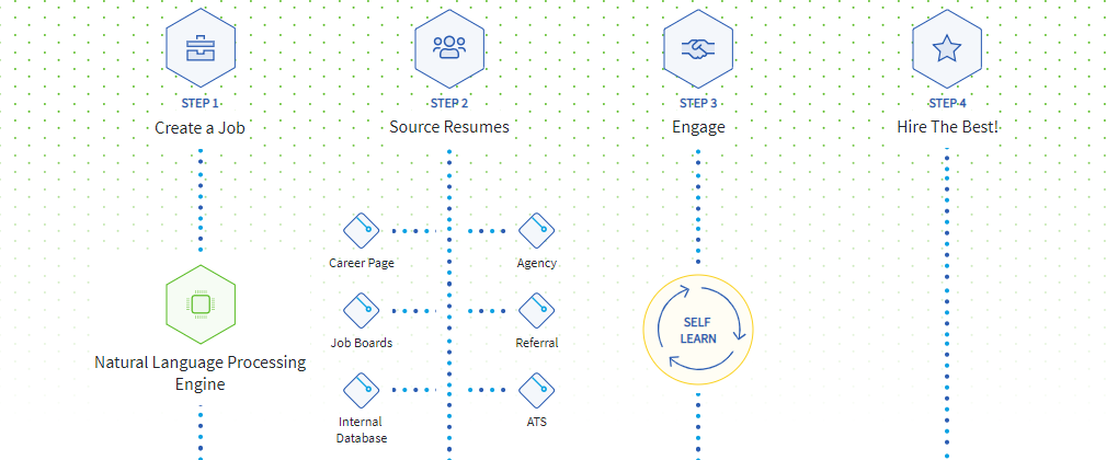
2. Healthi

3. Crowdera
The most important thing is that they have placed their CTA there and not giving chance to visitors to move out without performing the desired action.

4. RentSher
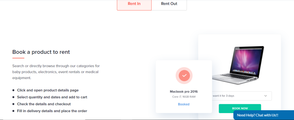
RentSher has used a different way of representing their process.
They have sub-divided the process into RENT IN and RENT OUT and explained both the processes separately.
5. HyperPure
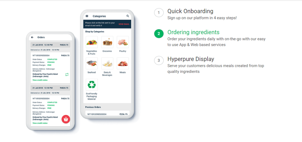
HyperPure have highlighted the steps in a unique way.
It still is attractive because they have used responsiveness in it, as the point changes the associated image also changes.
6. Slang Labs
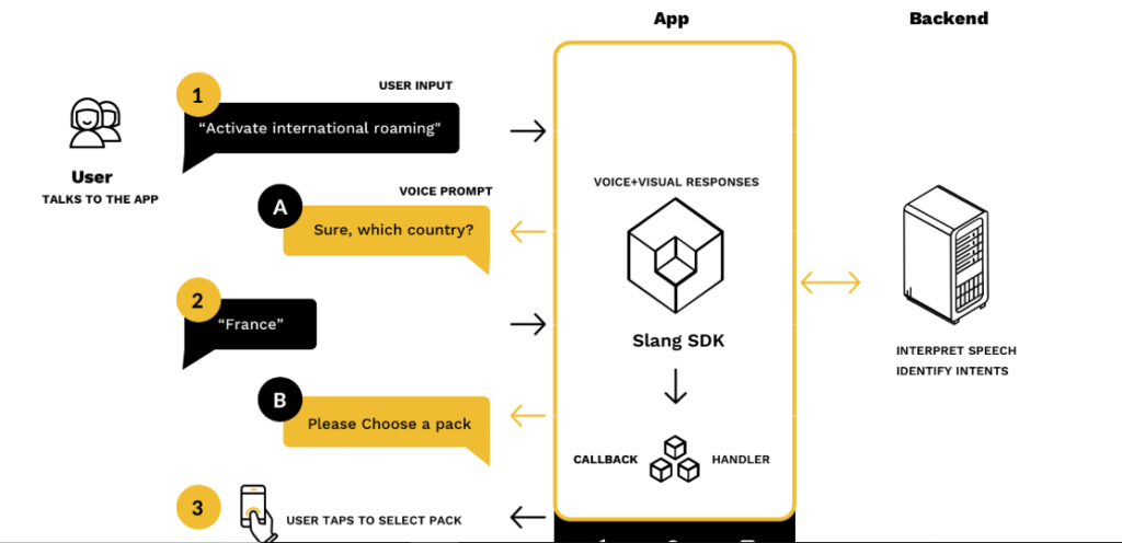
Slang Labs have shown exactly the way the user will experience the actual product and this is very unique.
7. Hansel
Hansel has done incredibly well to showcase the work process. They have used almost everything in one place.
They have used colors, graphics, text, flowchart and added responsiveness to everything.

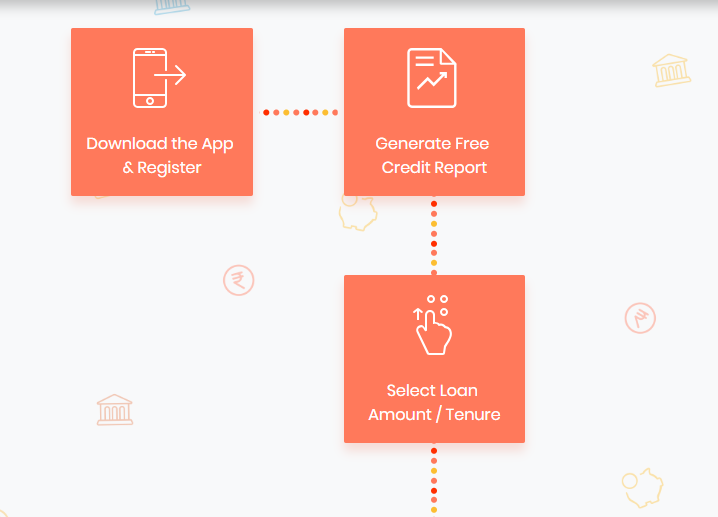
8. Shubh Loans
Shubh Loans have a simple block flowchart with related symbols and for ease of understanding, there is also a video of the process.
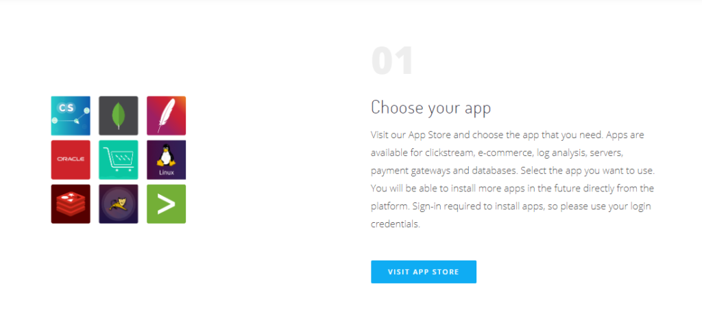
9. IQLECT
Though IQLECT is showing through the text written in paragraph format yet they have made it interesting through its presentation and related images.
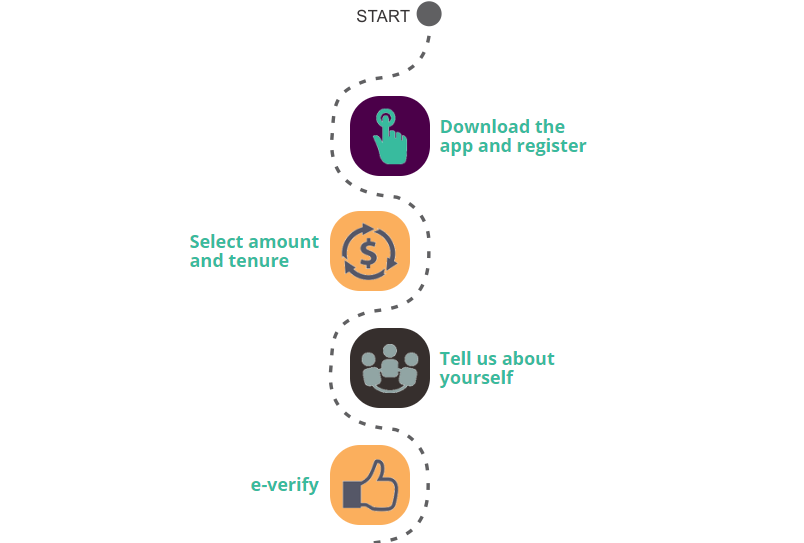
10. Avail Finance
Avail Finance has used simple but effective presentation through the concept of START and FINISH. The text is minimal with right use of icons.
Conclusion
After checking all the above ‘How it works’ pages/ sections, one thing is certain that creativity has no limit and even complex solution can be communicated in simple manner.
If you think we have missed a startup or you want to suggest something, please write to us at team(at)vidsaga(dot)com and will include your suggestion as well
About VidSaga.com
Vidsaga is a global marketplace for Organisations to create Videos. Consider it as “Upwork/ Fiverr for videos” with Creative script writing and professional project management


