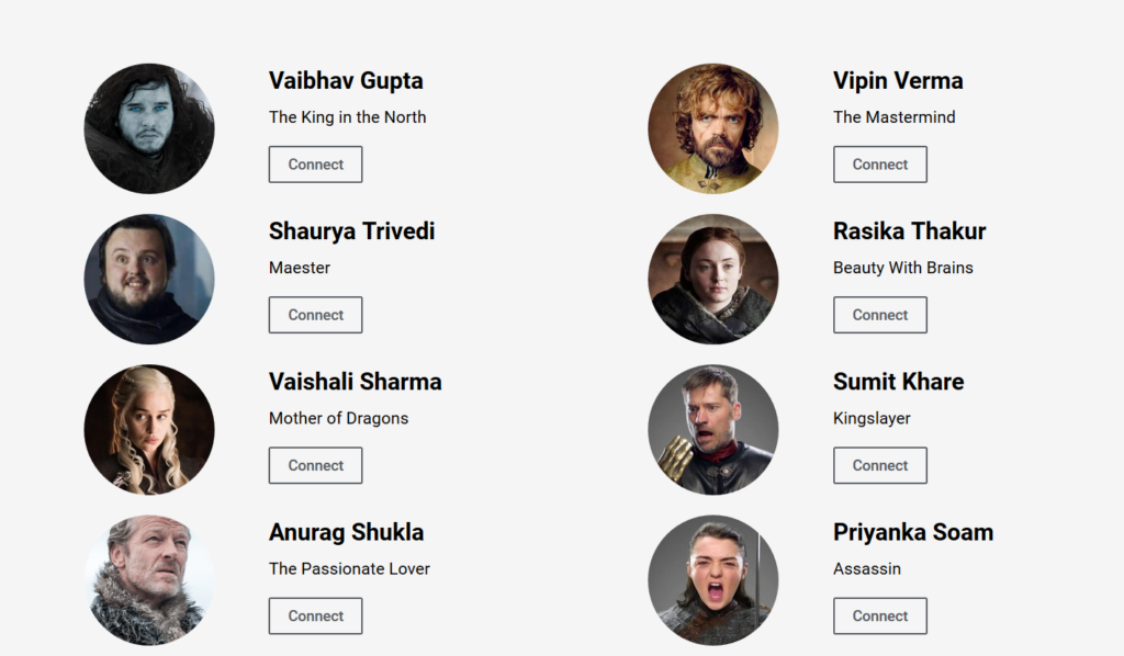
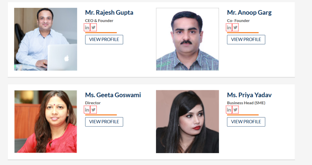
Top 10 Indian Startups with Best Team Page Design

Ask your parents to buy stuff online or do an online transaction and more often than not they will feel uncomfortable.
They might give you any reason but the main reason is that subconsciously they can not trust anyone whom they have not seen or can not attach a face to.
Tech startups need to take this human trait seriously and this is where Team page comes handy. Now a days creating an effective Team page is no longer a formality but its mandatory to build that trust.
In order to help other startups, we have compiled a list of 10 Startups who have created killer Team Page design with their unique approach.
Disclaimer: This list is not in any particular order. The idea behind compiling this list is to learn from these startups and at the same time share this learning with other startups.
Top 10 Indian Startups with best Team Page Design
1 Signzy

Why: This team section can be termed as “near perfect”. It not only showcases all the team members with their pics, but also the way they explained a team member’s description is great.
2 Mad Street Den

Why: Firstly they mentioned the role of founding team in detail and then they showcased all the team members in a creative way. It definitely creates an impact in the visitor’s mind.
3 Groww

Why: Again an amazing team section, it looks so genuine. They describse each members with their unique personality. It makes all team members so relatable and hence makes a strong personal connection.
4 Growth Hack World

Why: It is quite contradictory to include this page because they didn’t include the real images of the team members. But yet I have included because of their unique and creative approach.
5 Sqrrl

Why: They didn’t include the description part but defined their teammates in 1-3 words. In my opinion simple yet effective team page.
Also read:
Top 8 Indian Startups with Best Career Page
6 Cash Suvidha

Why: This page is really interesting. They clearly showcase everything you need to know about their team. The most interesting part is every team member have their individual pages as well.
7 Fincash

Why: They present their team members and their portfolio with their linkedln profile link but in a creative way. Also their images are quite human and relatable.
8 The Capital Net

Why: Again, the presentation is good. The description of each team member is in crisp and consists of both their personal as well professional information.
9 In Three Access

Why: The thing I liked about this page is that they described each and every team member genuinely and this is so relatable.
10 i3 Systems

Why: Very nicely and creatively presentation of all their team members. It also gives you an option to check a little more descriptive profile.
Conclusion
The team page is neither a page where you can merely do a formality to list your team members nor a page to introduce a formal side of the team, but it’s an opportunity to showcase authenticity of your Organization and leave an impact for all your stakeholders (especially for prospective employees).
If you think we have missed a startup or you want to suggest something, please write to us at team(at)vidsaga(dot)com and will include your suggestion as well.
About VidSaga.com
Vidsaga is a global marketplace for Organisations to create Videos. Consider it as “Upwork/ Fiverr for videos” with Creative script writing and professional project management
Featured Image Source


